Executive profiles help your visitors learn more about your agency leadership.
They can be displayed vertically or in a horizontal banner at the bottom of
your homepage.
Profiles usually include a(n):
Image or icon of the executive
Name
Job title
Agency or department name
Link to contact information or bio (optional)
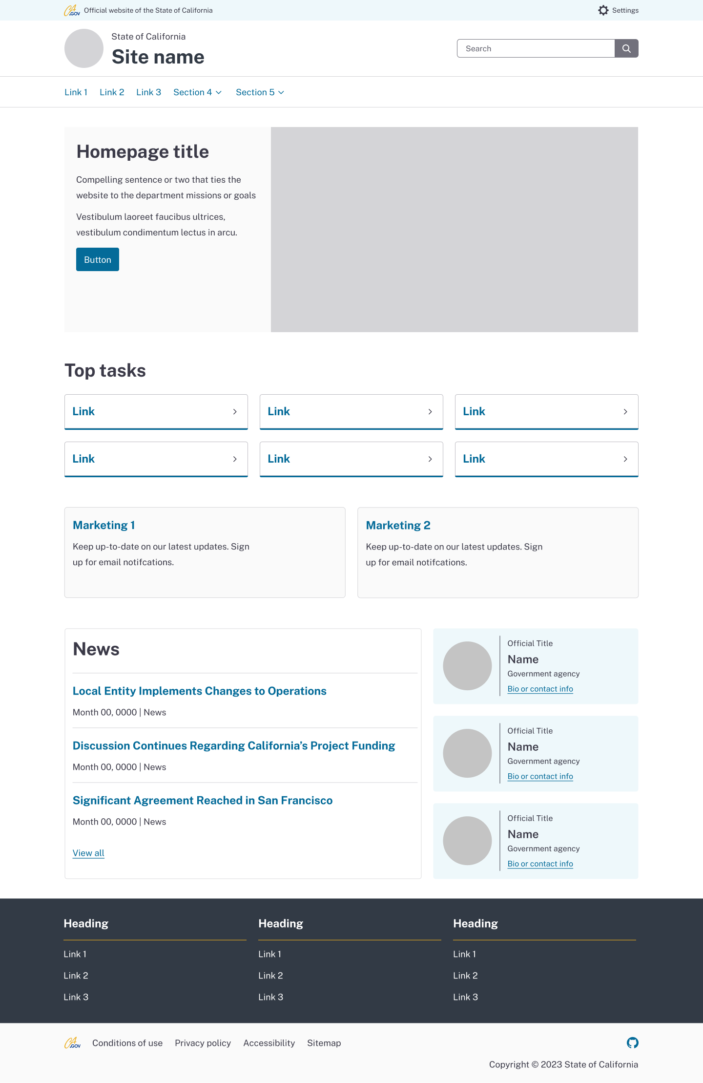
Default
The background color is your color theme’s secondary color.
Keep the executive profile simple. It should only display a portrait and basic
information about an agency leader, then link to a bio or about page for
detailed information if needed.
Common agency leaders include the:
Governor
Agency secretary
Department director
The executive profiles are transparent. Select colors that work for your
background color. Use dark text on light backgrounds, and light text on dark
backgrounds.
Note:
Make sure to get approval before using a person’s banner. For instance, the
Governor’s Office may want to use a specific image or content.
How not to use it
Do not feature more than three executive profiles on a page.
Do not use the executive profile to feature staff members. This pattern should
be reserved to the directorate level of leadership.
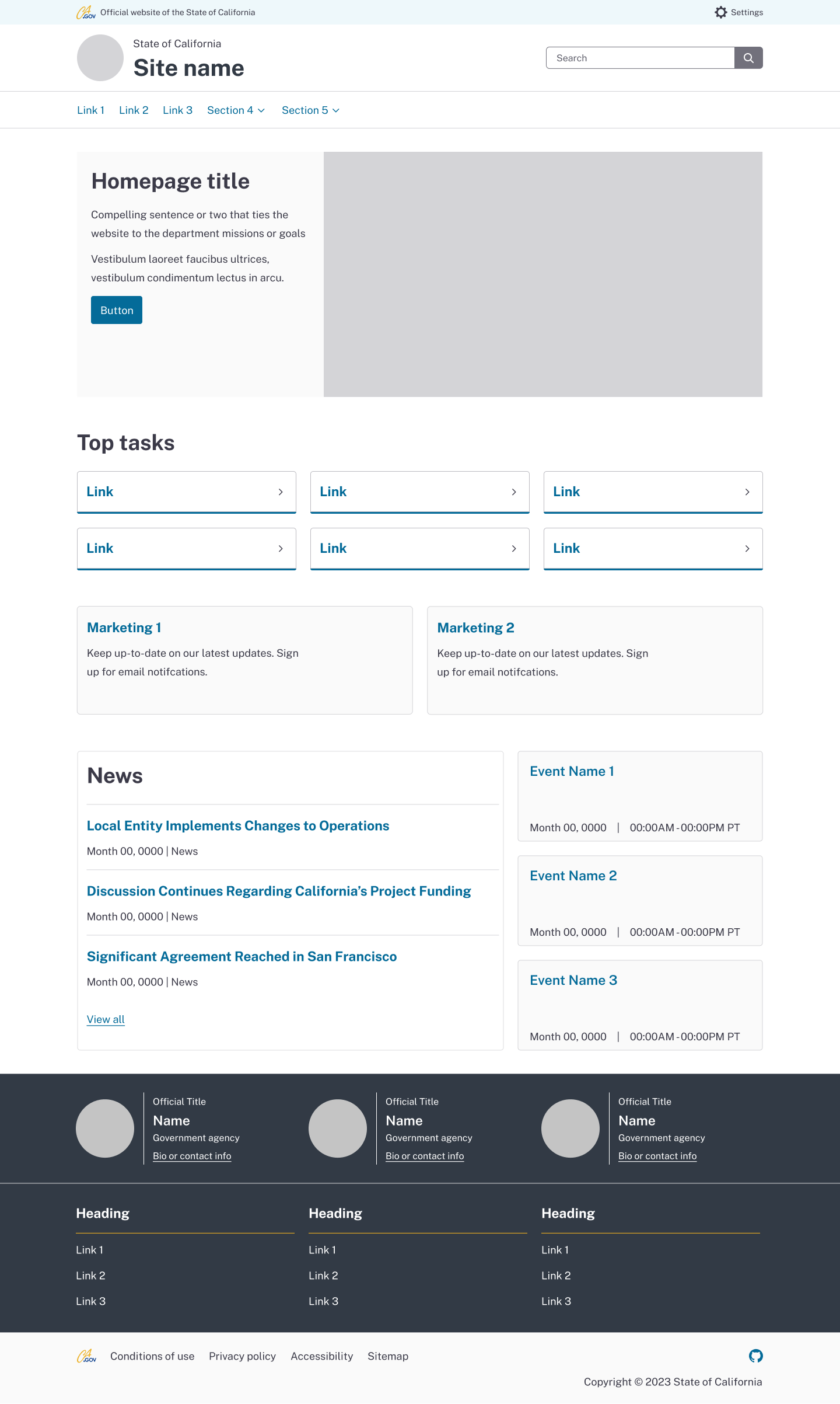
Layout
These sample layouts show the recommended visual arrangement of executive
profiles.
Default
Vertically stack default profiles next to a large area of content above the
footer.
Transparent: Dark background
Horizontally place transparent profiles next to each other above the footer.
These profiles will vertically stack on smaller devices.